

Hi everyone and welcome to another week of Case-ing the Catty! This week we are being challenged to use the colours in the Ornate Garden Suite. The colours include Early Espresso, Bumblebee, Mint Macaron, Old Olive, Terracotta Tile and Whisper White. In case you didn’t notice – Bumblebee is one of our new 2020-2021 In-Colours – you can’t buy the ink or card stock yet, so for the purposes of this challenge I just used a yellow I already had.

I started by using my sponge brayer to create a layered colour background consisting of Old Olive, Mint Macaron, Daffodil Delight and Terracotta Tile. I don’t know about you, but I haven’t used Terracotta tile much and I didn’t realise it had such a pink tone to it. When I thought about using it for this background I thought it was going to be way too ‘burnt orange’, but it actually worked perfectly.
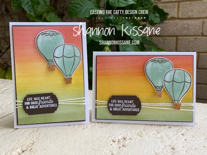
When I started off making this card, I had an idea about what I would do, but I wasn’t really sure whether landscape or portrait would work best, so I did both. And I still can’t decide which one I like better!
When you use a sponge brayer, you can achieve different shades of colour by moving the colours over the top of one another and blending the colours. You can see in the landscape card the centre part is far more orange than the portrait version, its got a little more Terracotta tile in it. The brayers are such good value – you get 4 sponges and two handles in a pack, and you can just rinse out the sponges when you are finished with them.
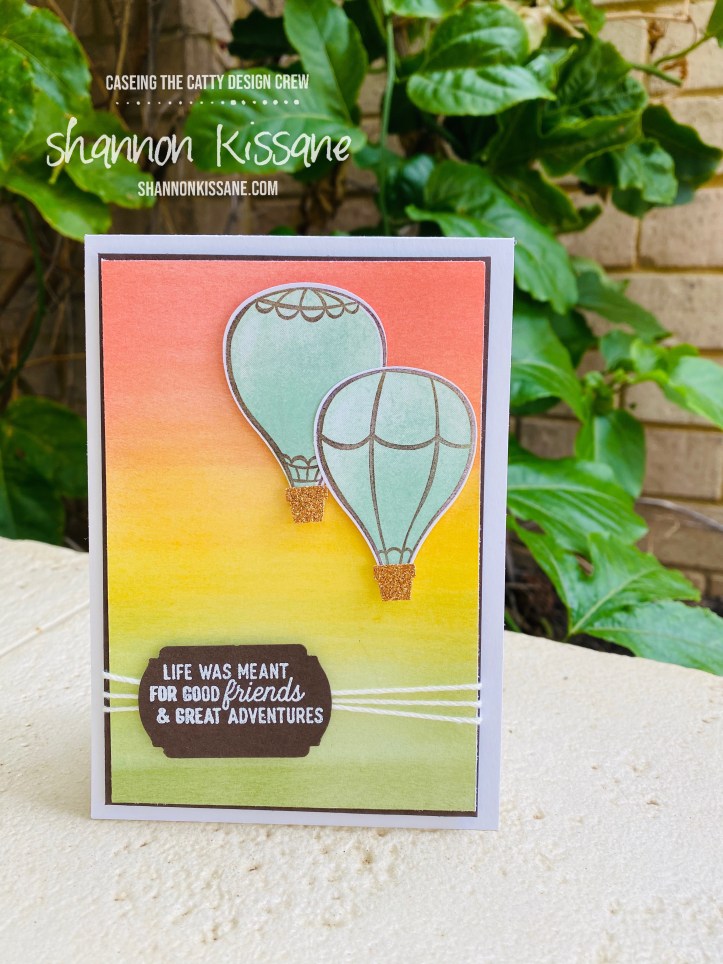
The hot air balloons are stamped in Early Espresso and then coloured with Mint Macaron. Both the outline and the coloured portion are stamps in the Above the Clouds stamp set and then punched out using the coordinating punch. This punch and stamp set (which can be bought as a bundle saving you 10%) are retiring at the end of the catalogue and so now are only available while stocks last. Check them out here.

The sentiment on both cards comes from Silhouette Scenes stamp set. I’ve heat embossed it in white on an early espresso label cut with the Label Me Fancy punch.
I did cheat slightly with the colour palette, as I used some glimmer paper for the balloon baskets, but I couldn’t resist a small bit of bling! I hope you have enjoyed these cards, let me know which orientation you like best.
We’d love you to join in with our challenge this week, if you do please share what you make on our facebook page.

Next up tonight is the lovely Siobhan – You will love what she is sharing!


They’re gorgeous, and I’ll pick portrait by a whisker as the No. 1
LikeLiked by 1 person
Thanks Rachel
LikeLike
Well I can’t really decide which one I like best! I’m just blown away by your amazing sponging! Great cards, and a stunning way to use these colours.
LikeLiked by 1 person
Thanks Julia 🙂
LikeLike
I love your blending of the colours, just perfect!!
LikeLiked by 1 person
Thanks Rebecca
LikeLiked by 1 person
Wow, your backgrounds are stunning! They are so dreamy, and perfect for the hot air balloons.
LikeLiked by 1 person
Thank you Tina 🙂
LikeLike
Absolutely love the sponged background and the colours are perfect for a skyline. I think I like the portrait one better if I had to pick one.
LikeLiked by 1 person
Thanks Michelle 🙂
LikeLike
I think your cards look great in both landscape and portrait orientation! One of my favourite times of year is when the hot air balloons fly over Canberra, and although its the right time of year it isn’t happening this year 😦 Your cards were a happy reminder of them though.
LikeLike